App Improvements for
DispatchHealth

Overview
DispatchHealth provides a service that delivers healthcare workers into the home of patients. They offer a mobile app for patients to use to request an appointment. This request process includes a call back from a care team representative after a request is submitted, to schedule the appointment and assign a medical team.
Problem
The number of users who complete a request through the app, and become assigned patients, have a high cancellation and no-show rate.
Goal
Reduce cancellation and no-shows from app initiated requests
Challenges
Technical limitations
Time constraints
My Role
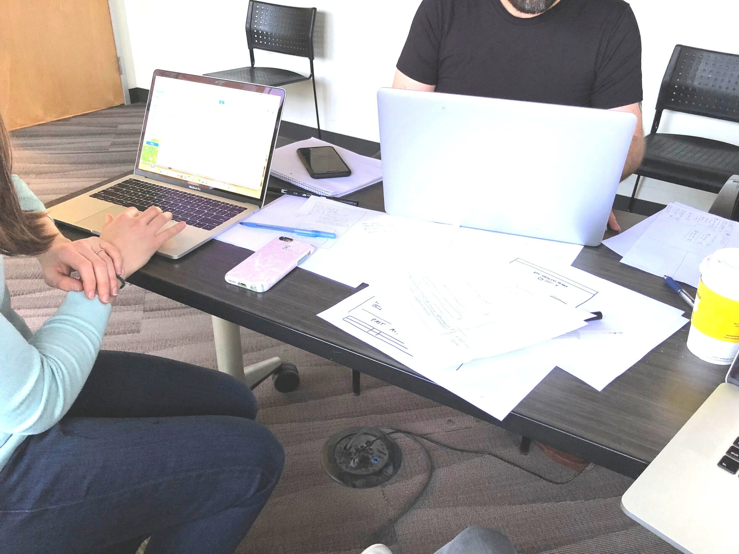
I led the design of the app updates for (both iOS and Android) alongside a product manager, from kickoff to detailed visual design.
Request Flow Research
Stakeholder Interviews
Understand the goals, logic, and technical constraints behind existing design and content decisions, document any business rules.
Flow Audit
Document the existing care request flow and highlight the areas that were causing the most friction. This was the foundation used to start to re-architect the request experience, as well as build a roadmap and list of improvements to tackle inconsistency across the app.
User Testing
Get a baseline of user expectation for the app today, and where we’re failing.

Findings
Communication
• Inconsistent, unclear, and unfriendly language. We need more empathetic communications that clearly states status and tasks.
Usability
• Non-native web patterns making actions cumbersome and buggy
• No situational flow outcomes depending on user type (return user, new user)
• Poor accessibility
• No usability standards (inappropriate primary actions, input validation and errors)
Design Consistency
• Varying: button, modal, text, field, interaction, animation styles depending on which screen you land on. We need to adhere more closely to ios human interface guidelines and apply them consistently throughout the app.
Scoping & Prioritization
While my research uncovered significant communication, design, and usability issues, the project scope was rigid. I focused some of my efforts on providing solutions that helped improve overall design on relevant screens related to the scope, but also began documentation of problems across the app. This list was comprised of bugs, design, and usability issues, as well as component documentation needed to create a consistent and reusable system for the app.

What Changed?
Request Confirmation

• Updated usability and design standards
• Clear communication about next steps
• Additional screen to communicate next steps for a request received after hours
Request Statuses

• Updated usability and design standards
• Addition of ETAs, information we have, and did not previously display
• NPS score capture post appointment (a business priority)
Results
38% drop in cancelled requests
26% drop in inbound calls about app initiated requests
1.2% drop in no-show patients with app requests
What’s Next?
Global app improvements are slated for this quarter, to help meet our patient volume KPI. In my role as lead designer of a newly formed ‘consumer team’, I have been exploring better design standards across the app. By improving the design of the app as it exists today and implementing better metrics, we will have a strong baseline to begin to improve the experience off of the behavior and needs of our users, rather than unvalidated assumptions.
